Let’s read some few quick website statistics of 2021
The greater number of landing pages you have, the greater number of probable leads you get.
More than 50% of all website traffic comes from smartphones.
61% of consumers plan on spending more time online post-pandemic than they did ever. (Salesforce)
On average, total of 69% of website content is never seen by visitors.
On average, it requires audience 3 sessions to convert into sales.
Here are some of the mind-blowing facts and figures stated. While reading this article, you might be thinking that high-conversion websites would be doing test-running every once in a while and would be dedicatedly investing in optimizing their website. Surprisingly, most of them do run a quick check less than 5 times in 2 months.
Then what are they doing different? Let’s now jump on the topic.
1. Persuasive and tested CTAs
The main tagline on your Homepage is very important. Eye-catching taglines and call-to-action subjects have proved to improve conversions by 49%. Be very clear and specific about what you offer to the audience. Improving the graphics quality has also proved to double the conversion rate, as reported by Hubspot.
CTAs are an essential part of your content. Find out what your customers have frequently asked questions or what they want to hear. Highlight those pinpoints and use them effectively.
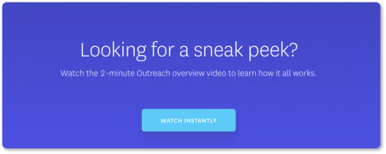
A clear example is shown here:
2. Pop-ups / “Chat Now” or Live Chat facility
This feature is a winner.
Bonus? Many plugins provide a free version of it!
Adding pop-ups, in any form, can never go wrong. Be it as special discount, chat now, new product, discount code, testimonial, recent purchase, current news. It also gives a sense that website is active. The impact of this is so large that you can even skip the other points. The best thing is that you don’t annoy the visitor and get the benefit out of it.
3. Improved graphics / Putting Human faces on the Homepage
This is a tried and tested method. Customers have said that the websites with human faces look more lively and human-oriented than those who seem robotic and boring. This can be done in any form, either by showing happy customers or your friendly working staff in a picture. Add a spice to it by showcasing a glimpse of your company culture.
High-quality graphics are very important. The combination of both can take your site to the next level.
4. Adding testimonials, logos, reviews on Homepage
No one ever wants to be the first one to visit or purchase from a certain business. Therefore, you can utilize this opportunity and add some testimonials or reviews to deliver a sense of reliability and the customer will automatically generate a sense of ease while scrolling through the website. This has created a huge impact on conversions, and even in some cases, it has improved conversions by 200%.
5. Short form fields
Overly exceeding signup forms are undoubtedly the most annoying thing ever. Agreed?
40% of the visitors say that they close the website that requires signing up, and 20% of the visitors say that they get annoyed if the form fields are too lengthy and unnecessary. This is surely one of the best ways to kill your conversion rate. It is important to remove unnecessary fields and save your important leads.
6. Adding third-party signup service
Who doesn’t love when the signup page shows you the option of “Sign up through your Gmail Account?”? Absolutely, everyone loves that!
Adding this feature in your website and you will see the immediate results by yourself.